Wednesday, November 5, 2008

Pictures

Perspective.
Balance.
Color theme.

Stefany Townsend

Monday, November 3, 2008

Photo Assignment

1.) Line used to indicate Perspective.


2.) One Color Scheme


3.) Shape and Contrast to Illustrate Balance.


~Justin

Distance, Color Theme


Shatara Way.

Monday, October 27, 2008

Edible Water.


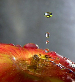
To begin with, the soft grey background brings the apple and the water droplets to the foreground; this forces the viewer to immediately look at the water droplet and mentally watch it as it hits the apple. After watching the water droplets, the image also forces the viewer to look at the puddle of water in the center of the apple; this led me to start wondering if the focal point of this piece was the water droplets or the puddle of water?

Next, seeing the apple makes me think the image is more of a geometrical shape than it is an organic one. The assortments of reds and yellows on the apple gives the image a bright feeling; as if the viewer's mood will be instantly lifted after viewing this image. Also, the puddle of water in the center of the apple, makes that particular part of the image appear to have a rough texture. To sum it up, I choose this picture because it intrigued me and it made me think of how long it took the photographer to capture the water droplets falling on the apple.

-Shatara Way

Perspective & Line


original context (flickr): july1777's photostream

This interesting photograph of a Korean food market successfully communicates elements and compositional elements of two-dimensional design. The lines created by the stools in the photograph give depth to the space within the rectangle. The stools emphasize the rule of thirds as well. Also emphasizing the rule of thirds is the woman in the first third of the photograph, dually the center of interest. The reds, greens and yellows help the photograph to maintain a complementary color scheme and also imbue an atmosphere significant to the title of the photograph (“Closing Time”)

-Samantha Williams

****My Photographs for assignment no. 2 can be found at my blog for this class

i love you.


The previous picture was "stolen" from deviantart.com. I selected this picture because of it's obvious use of color. The blocks were made to be the focal point through the use of greyscale on the surrounding objects.  Line was also used by the photographer, in which it helps the viewer to visually focus on the phrase in the photo in three lines versus one. Texture is also evident in the image. The letters are beveled rather than flat, helping to to add more depth to the image.

-Alexis Cummings

Wednesday, October 22, 2008