Wednesday, November 5, 2008

Pictures

Perspective.
Balance.
Color theme.

Stefany Townsend

Monday, November 3, 2008

Photo Assignment

1.) Line used to indicate Perspective.


2.) One Color Scheme


3.) Shape and Contrast to Illustrate Balance.


~Justin

Distance, Color Theme


Shatara Way.

Monday, October 27, 2008

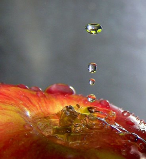
Edible Water.


To begin with, the soft grey background brings the apple and the water droplets to the foreground; this forces the viewer to immediately look at the water droplet and mentally watch it as it hits the apple. After watching the water droplets, the image also forces the viewer to look at the puddle of water in the center of the apple; this led me to start wondering if the focal point of this piece was the water droplets or the puddle of water?

Next, seeing the apple makes me think the image is more of a geometrical shape than it is an organic one. The assortments of reds and yellows on the apple gives the image a bright feeling; as if the viewer's mood will be instantly lifted after viewing this image. Also, the puddle of water in the center of the apple, makes that particular part of the image appear to have a rough texture. To sum it up, I choose this picture because it intrigued me and it made me think of how long it took the photographer to capture the water droplets falling on the apple.

-Shatara Way

Perspective & Line


original context (flickr): july1777's photostream

This interesting photograph of a Korean food market successfully communicates elements and compositional elements of two-dimensional design. The lines created by the stools in the photograph give depth to the space within the rectangle. The stools emphasize the rule of thirds as well. Also emphasizing the rule of thirds is the woman in the first third of the photograph, dually the center of interest. The reds, greens and yellows help the photograph to maintain a complementary color scheme and also imbue an atmosphere significant to the title of the photograph (“Closing Time”)

-Samantha Williams

****My Photographs for assignment no. 2 can be found at my blog for this class

i love you.


The previous picture was "stolen" from deviantart.com. I selected this picture because of it's obvious use of color. The blocks were made to be the focal point through the use of greyscale on the surrounding objects.  Line was also used by the photographer, in which it helps the viewer to visually focus on the phrase in the photo in three lines versus one. Texture is also evident in the image. The letters are beveled rather than flat, helping to to add more depth to the image.

-Alexis Cummings

Wednesday, October 22, 2008

Analogous Color


Max Coady

Internet Photo


This is a photo I found on the internet (specifically Deviant Art) that I thought was interesting. The runway and the sky have colors that contrast and give the picture a muted, dark look. I thought the perspective of the photo was more interesting it looks like its taken from a plane coming in to land.

~Justin Marking

Distance, Symmetry


-Max Coady


COLOR THEME.

The colors in the first are repeated throughout tying the colors of the wood in with the nails giving the photo an overall rustic feel. In the second we see the repetition of the natural greens and browns of nature in both the fence and the trees/shrubbery in the background.


D. Whitcomb


This image demonstrates asymmetrical balance.

One long limb filling a large empty void on one side of the picture while the opposite side is filled with the trunk and multiple tree limbs.

D. Whitcomb

Design Stuff

~Travis Erickson

1) Depth

2) Color (Contrasting)

3) Balance


2 Photos I took which illustrate distance/depth/perspective.

-The first uses line where the second better establishes depth through foreground, middle-ground & background.


D. Whitcomb

Analogous Color Scheme


-Kim Spann

Monday, October 20, 2008

Depth/Distance of the road

Color of water blended of light blue, blue, and white

Symmetrical

Photo Excercise #1

1. Distance/Depth/Perspective Using Line
Photobucket

2. Balance(Asymmetry)
Photobucket Photobucket

3. Color Theme/Scheme
Photobucket

- Juleah Chandler

intriguing


Intriguing Image: Lolcat

This is a “lolcat.” Lolcats are all over the Internet. They are images mainly used as humorous gestures, rather than more serious art forms.

This is an image that focuses on content. This image takes familiar objects and characters and humanizes a kitten to express the scene of a prisoner explaining, “Nobody knows the trouble I have seen.” The expression of the cat exemplifies agony and pain. This image is meant to be humorous and uses unconventional and incorrect spelling to help achieve this. Artistically, the color scheme in this image is mostly grays and white and tans that provide the background. The darker background gives this image value and depth. The subject is centered, but the bars balance the image symmetrically. The cat is the center of interest. The movement of the image begins with the cat, moves to the text, back to the cat, and ends with a laugh. The highlights on the wall and the bars indicate a front light source. This kind of image could be found at various locations on the Internet. Some examples would be blogs, forums, social profiles, and humor websites. The image itself, and the environment it is presented in explain the meaning and purpose of this image. I would send this image to a friend as a gesture of humorous entertainment.

Source: http://www.icanhascheezburger.com


~Travis Erickson

Desert Landscape Photo


This is an internet image I found. The viewer really gets the feeling of expanse and depth here. The vegetation in the foreground adds color and perspective, and you can really feel the texture of the sand. The dunes in the background give the image an interesting range of values and rhythm.

Max Coady

I choose this picture of bacteria because of how appealing it was to me. Even without the bulls-eye image the bacteria form a circular image with the arm-like pieces pointing toward the center.  Another element that heavily focus on the bacteria center is the use of color how the brighter colors like red, orange, and yellow sit atop of duller colors like blue, purple, and green. As you look the color of the bacteria gradually change from red, orange, and yellows to the more duller colors as you get closer to the center; kind of like a sun set (the longer it last the more the switch to duller/cooler colors  until darkness). As for size, since most of the objects are the same proportion nothing stands out more than anything else except for the bulls-eye overlaying it. 
By Christopher J. Delee

Intriguing Image:What Does The Image Mean?


The picture that I have chosen is the formation of a house, or possibly a building used for important aspects. Choosing this building, and observing it, tells us that sometimes the most difficult combinations can signify togetherness that can bring out the area as well as shape, if that is the intention. By looking at the building, it seems like a triangular formed housing, with windows outside that are not following the pattern. As you look at it. The shape definitely moves closer to the picture, but like it is pointing to the sky, especially at the rooftop. By looking at the roof, it has a right triangle shape when you look at the top of where the triangles are seen on the ceiling on the outside of the building. But as you look at the top, it is almost like a straight line, but it’s linearity goes upward as the line reaches the pointed edge. The form definitely signifies thickness because the building is shaped as if it is almost double layered. With the outside walls looking a bit wide towards the top of the picture. Though as you look on the right side, the wide top starts to go down and shrink as it approaches the ground. But on the left side, it is still thick buy goes down with an angle instead of inward like on the right side. Now, the triangular shape combines with line shapes as if they were both brought together to make something that is balanced, but exempts contrast as you look at it. Such as, the lines that are on the glass that goes from the ceiling to the floor. And as for the color, most of the color is green with some yellow showing on the inside of the building. But not just straight green, there are light green and a darker green. The light green shows more towards the glass of the building and the darker shows on the side of the building. Surprisingly, even though there is darker green on the side of the building, there is also dark green on the ceiling top on the outside of the house with some light showing from the two triangular windows that are also attached to it. Seeing the colors make one see the balance in the colors that are taken in the picture, almost like the colors are resulting equilibrium. But what is also awkward about this photo is that almost everything signifies a triangular shape that almost resembles the building. For instance, the pot of flowers looks like the windows with light bouncing with yellow, brown, and green off the plants. The difference between the two is that you can see the windows entire shape while the shape of the flowerbed is pointing out of the picture (almost as if it was not intended to be in the picture at all.). Basically from looking at this picture, there is some togetherness trying to come out, but also there is more than one way to look at it as well. That togetherness results from combination of the building to signify the outside, from the flowerbed and do not forget the ramp walkway that connects with the building wall on the left side of the building.

Beautifully Captured.


The strategic planning behind a photo with such composition to me takes this photo from intriguing to at a certain level, intimidating.  It is obvious that the photographer was in touch with both the elements and principles of design so, please excuse me while I attempt to exercise my knowledge of the concepts that she so perfectly captured. 
The photo is composed in such a way that the photographer basically holds your hand throughout the entire viewing process. She uses line, color and balance to guide our eyes from the center of interest through the composition in a rhythmic directional movement. The photographer begins the directional movement by using color. By photographing a red boat in a dull greyscale background the red becomes dominant therefore giving our eyes a center of interest. Line is the next element she uses to guide us through the image. Our eyes automatically follow the waters edge and the line of boats into the background of the photo. Notice that the canoes are facing with their pointed tip all in the same direction almost like a line of arrows. Upon changing our focus to the background we notice the color again in the trees. The natural green then offsets the original dominance of the red in order to give us a more peaceful appeal and allows us to "lose sight of the shore" long enough to enjoy the entire photo. Due to the balance of the image our eyes are again guided back to the foreground along the waters edge and this time by the line of cars along the road. We now notice the boat on the right side of the photo and the color of it. Because the boat is blue our eyes automatically jump back to the red boat simply because of the contrast between the two colors and the dominance red has over blue. Now we are back where we started. The center of interest. 
The photographer saw all of this prior to capturing the image but to ensure that the viewer would see exactly what she did, she mapped it our perfectly so that our eyes had no choice but to follow her lead. 

sheer genius. 


D. Whitcomb

Depth and Line

-Kim Spann
This is an interesting photograph from a Nissan advertisement.  The composition of the photo is really appealing and the perspective of the shot gives it depth and draws the viewer into it.  The visual lines, such as the horizon and edge of the road, and the implied lines, such as the beam of light shining down on the car and the headlight, all radiate towards the car, which is the center of interest.  The blue-green darkness of the lower left portion of the photograph is contrasted by the intense yellow light of the upper right portion.  This color scheme based on complementary colors gives the photo balance and visual stability.  
-Stefany Townsend

Photo Elements

Here are some of the photos I took this weekend around campus. These were a lot of fun to take and it was a new experience since this was the first time I really used a digital camera before, I hope you enjoy them! (There were actually a total of over 400 different pictures but here are a few for each category.)

Color


Shape/Balance


Perspective

It was really hard to choose which ones to put, so if you would like to some of the other photos I took please feel free to go to the art portfolio blog I am making at: http://kebart.blogspot.com/

Feel free to check out some of my other work and critique it! Any help or suggestions are greatly appreciated! (I am hopefully applying for the BFA program next year if possible.) It is still under major construction but there are four pictures for each section of photographs for this project if you would like to see more!

~Karen Borden


Asymmetrical Balance

-Kim Spann

This is what I did yesterday.

These are the photographs that I took for this assignment. My interesting photograph from the internet is on my computer at home, and I can't find it today. I guess I'll do that part of the assignment when I get home tonight. Actually, it was all finished last night, but then all of a sudden my wireless internet disappeared. Totally weird!

1. Perspective demonstrated with the use of line:


2. Balance (there are two!)

3. Unified color scheme:

Yes. Yesterday was as fun as it looks.
Love,
Brooke

Japanese Perspective


This is an image I found from the internet that I thought was very interesting and was a great example of perspective with line. In this photo, the bold line-like wood covering emphasizes how the shape and size of the wood pieces get smaller as the viewer looks farther away in the image. Also, the red is a really nice contrast for this picture with the neutral colors of the pale grass and stones against the background tree canopy. When the views looks at the center of this image they are almost absorbed by the staircase as it blends into the background.

~Karen Borden

Interesting Photograph


The rock serves as a center of interest for this picture. The rock, being slightly off-center, is more interesting than if it had been placed in the center of the composition. The reflection of the rock in the water serves to extend the rock's original line. In fact, the rock and its reflection almost completely dissect the composition from top to bottom. The reflection of the rock helps to draw the eye to the only other object in the foreground, the boat.
The boat is a clearly defined form. Its color is distinct from the water surrounding it and provides contrast witht the water and harmony with the bare rock. The boat is much less weighty than the rock beside it because it is so much smaller. Though the rock is really the center of interest, the boat does share in the impact because it is the only other object in the foreground.
The composition is nicely balanced. The background utilizes the rule of thirds with the sky, the mountains, and the water each taking up approximately a third of the space. The rock and the boat provide an approximate balance in the foreground. Over all, the composition displays an approximately symmetrical vertical balance.
The color scheme of the picture is very natural; it uses mostly greens, browns, and neutrals. The more vibrant color of the water at the bottom of the picture helps to anchor the composition; the water gives the bottom of the picture a little more weight than the white sky at the top. The mountains serve to tie the vastly different hues of teh water and sky together. The vast difference between the water and the sky, though, offers a nice contrast, adding interest and eye movement to the picture.
-Kim Spann
Sunday, October 19, 2008

Monday, October 13, 2008

Exercise #1

1. Go out and take a picture of a scene that emphasizes distance/depth/perspective using line.
2. Take another picture that uses shape and contrast to illustrate some sort of balance, ie. symmetrical, asymmetrical, radial,etc...
3. Take a 3rd picture that uses a specific color theme/scheme...

POST AND LABEL THESE PHOTOS--DON'T FORGET TO SIGN YOUR POST!!!